Config Carousel
The themes are listed one by one in the order in which they are displayed on the Unite Gallery administration page.
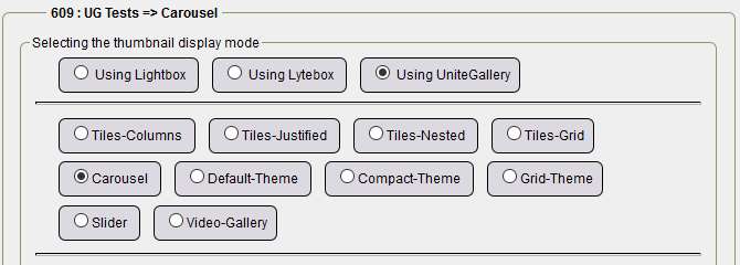
The configuration with default values is displayed by selecting the Default values check box and clicking Save configuration. So we assume you checked the box and then click Save config.
For Carousel
Main options :
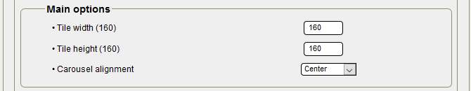
- Tile width: by default 160, with 160, you have 5 tiles displayed for a width of 940/950px for the central boxes, with 210 tiles it will be 4 tiles,
- Height of tiles: by default 160, you can try 210 or another height,
- Alignment of the carousel: left, center, right and left selectable.
Gallery options:
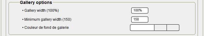
- Gallery width: 100% - why change? to put 98%, we leave 100%.
- Minimum gallery width: 150 (for 150px), you also have the choice of 300, no more for displaying on smartphones from 320px screens.
- Gallery background color: transparent to preserve the background color of the central boxes, especially if there is a transparent background.
Carousel options :
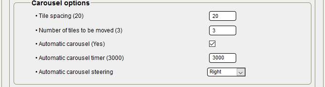
- Tile spacing: 20 by default, no change,
- Number of tiles to move: 3 by default,
- Automatic carousel: checked for automatic start,
- Automatic carousel delay: 3000 by default, in milliseconds you can try 4000,5000 to slow down the scrolling,
- Automatic carousel steering: with the right or left selection, right is selected, scrolling from right to left.
Navigation options:
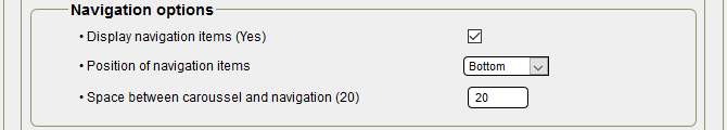
- Display navigation elements: checked the arrows are displayed, unchecked no display,
- Position of the navigation elements: to the Low or High selection,
- Space between carousel and navigation: by default 20, no change.
Tile design options:
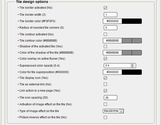
- Tile borders enabled: With Default values unchecked, I checked it to put a black border of 1px,
- Width of the tile border: 1 instead of 3 by default,
- Tile border color: #00000000 instead of #F0F0F0F0 to match the background color of the central boxes,
- Radius of rounded corners of tiles: 0 as default,
- Tile Contour Enabled: By default, not enabled,
- Tile contour color: default,
- Tile Shadow Enabled: enabled by default, here unchecked so disabled, it is a choice not to overload the tiles page.
- Tile shadow color: default,
- Superimposed color overlay activated: By default, enabled is the color change when the mouse pointer passes,
- Opacity of the color superimposed: by default 0.4, but 0.5 / 0.6 are possible, be careful to leave a transparency,
- Tile overlay color: by default, you can choose another color,
- Tile display icon: by default, icon activated when each tile is hovering,
- Tile as an external link: by default disabled, in Comments, it is possible to put an external link on each tile, in this case, it is necessary to tick,
- Link action in a new page: default, checked
- Tile icon spacing: by default 26, original space between icons, with small tiles can be changed,
- Enabling image effect on the tile: by default, disabled,
- Image effect type on the tile: by default Black and white, at selection: Black and white, Blur or Sepia,
- Reverse image effect on the tile: by default, disabled.
Tiles text panel options:
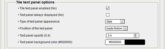
- Tile text panel enabled: by default, disabled, here it is ticked for display,
- Text panel always displayed: by default disabled, unchecked and disabled, this is an option!
- Type of text panel appearance: by default Drag & Drop is selected, optionally with Fade,
- Text panel position: By default Inside bottom, you can choose from the following options: Inside bottom, Inside top, Inside center, Top and Bottom,
- Opacity of the text panel: by default 0.4, pay attention to transparency with the photo if you increase,
- Text panel background color: By default #00000000, you can change the color.
Lightbox options :
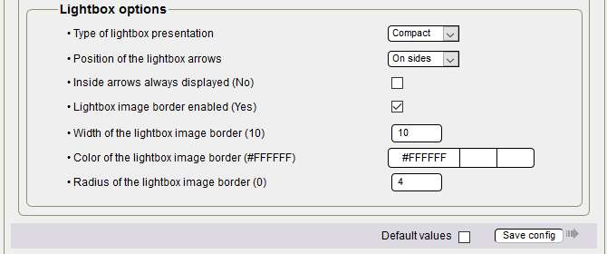
- Type of lightbox presentation: by default Large, here Compact, at the selection you can choose between Large and Compact,
- Position of the lightbox arrows: by default On the sides, at the selection you have the choice between On the sides and Inside (of the photo),
- Indoor arrows always displayed: by default disabled, you can check as you wish,
- Width of the lightbox border: by default 10, beware this border is only displayed with Compact, with Large no border,
- Lightbox image border color: by default #FFFFFFFF (white), as the background is black, always a light color,
- Radius of the lightbox image border: by default 0, here 4 for a slight rounding at the corners.
Before going any further, a click on Save config is necessary to validate the configuration and update the theme construction.
Building the theme :
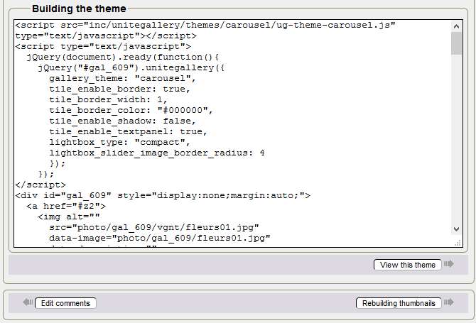
Here is the code of your updated gallery, a click on Show this theme and your gallery is displayed in a new tab.
Above all, do not modify the code manually to get your purposes, change the configuration again for the corresponding part, then save the configuration and display the theme again.
You're reading this line! Congratulations, you just finished configuring the fifth theme!

Tutorial by Papinou and Saxbar for the GuppY Team - November 2017 - CeCILL Free License


