Homepage/blog config
Homepage-Blog config
In the settings pane, when you click this icon:  you arrive on the configuration of the home page.
Home page config :
Here is an overview of the configuration of the home page, you will notice the choice WEB (green) and MOB (blue) that allow you to independently configure the computer screen on the display and on mobile and low resolution tablets (less than 1024 pixels wide).
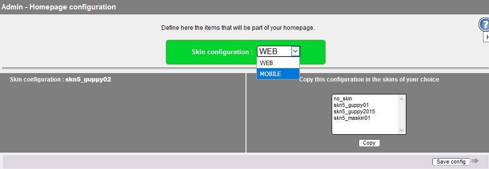
You must independently configure both WEB and MOB versions by selecting the version as shown in the image above.
For the MOB configuration, it is preferable to use only one column with a 100% width.
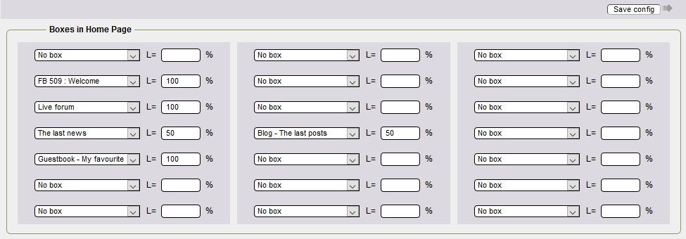
- On the second line, you have the Welcome article which is displayed on the full width available for the central boxes, i.e. 100%.
- On the third line, you have the display of the forum live over the entire width or 100%.
- On the fourth line, a box at 50% width and a box at 50% width or 100%, this allows to display on two columns
- On the fifth line, you have the guestbook display over the entire width, i.e. 100%.
Lines 6 and 7 are not used
Blog config
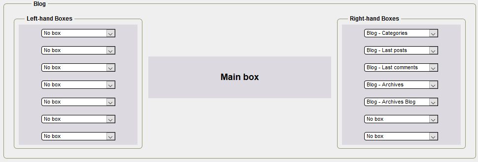
- In this section, you configure the boxes in the blog's side column.
- For the MOB configuration, it is preferable to use only the right column.

In the last part of the configuration, you can hide or not the display of the side boxes on the home pages
You must define the number of news, posts, height in pixels for news, posts and messages in the live forum, the number of messages in the forum, the message in your guestbook.
The setup is complete, click on "Save config".
