Tabs, Accordions, modal window
We will configure Tabs, Accordions, Modal window :
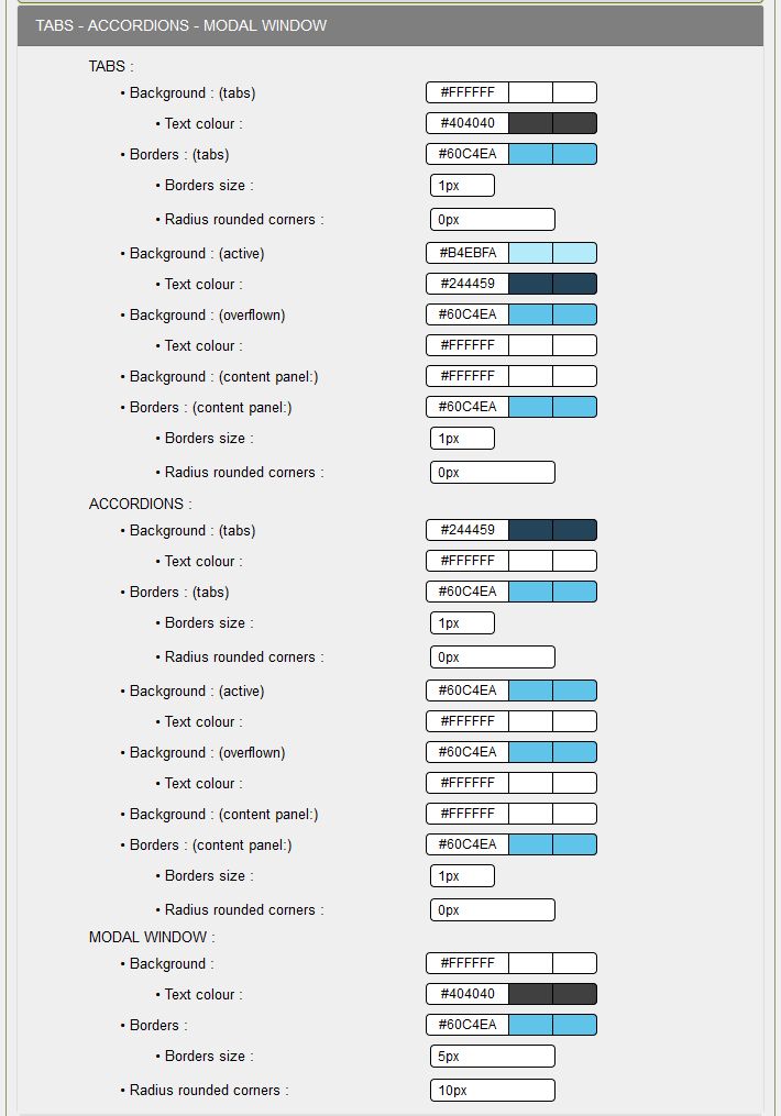
TABS:
These are the tabs used in the Technical box of the demo database by clicking on Demos.
- Background (tabs): Set the background color of non-active tabs,
- Text color: Choose the color of the tab text, here #000000,
- Borders (tabs): Add the color of the border of the tabs, always #73C2FB for this skin,
- Border size: 1px, usually this size is used
- Radius of rounded corners: 0px, no rounded corners, if you put 10px 10px 10px 0 0, both top corners will have a rounding of 10px,
- Background (active tab): Set the background color of the active tab, here #B4EBFA
- Text color (active tab): Set the text color of the active tab according to the background color; here #03224C
- Background (hover tab): Put the background color of the hover tab, look at the color of the Preamble to the opening of the READ ME, here #73C2FB,
- Text color (hover tab): Define the text color of the active tab according to the background color, here #FFFFFF
- Background (panel content): Add the background color of the panel that will contain your text, here #FFFFFF
- Borders (panel contents): Add the color of the panel border, always #73C2FB for this skin,
- Border size: 1px, just like the border of the tabs,
- Radius of rounded corners: 0px, no rounded corners, if you set 0 0 10px 10px, both bottom corners will have a rounded 10px,
ACCORDIONS:
These are the accordion blocks used in the Presentation box to Demos in the demo database.
- Background (tabs): Set background color for non-active tabs, here #03224C
- Text color: Choose the color of the tab text, here #FFFFFF,
- Borders (tabs): Add the color of the border of the tabs, always #73C2FB for this skin,
- Border size: 1px, usually this size is used
- Radius of rounded corners: 0px, no rounded corners, if you put 10px 10px 10px 0 0. Both top corners will have a rounding of 10px,
- Background (active tab): Set the background color of the active tab, here #B4EBFA
- Text color (active tab): Set the text color of the active tab according to the background color,
- Background (hover tab): Set the background color of the active tab, look at the color of the Preamble when opening the READ ME, here #73C2FB
- Text color (hover tab): Define the text color of the active tab according to the background color,
- Background (panel content): Add the background color of the panel that will contain your text, here #FFFFFF
- Borders (panel contents): Add the color of the panel border, always #73C2FB for this skin,
- Border size: 1px, just like the border of the tabs,
- Radius of rounded corners: 0px, no rounded corners, if you put 0 0 10px 10px, both bottom corners will have a rounding of 10px,
MODAL WINDOW:
You will find an example in the box Presentation of the demo base by clicking on Demos.
You arrive on a page with a "Click me" invitation, you can click to display the modal window.
- Background: Set the background color of the window for text, here #FFFFFF is white
- Text color: Set the text color of the active tab according to the background color,
- Borders: Add the color of the window border taking into account the dark background,
- Border size: 5px, a little fancy, it's possible,
- Radius of rounded corners: 10px, the four corners have a rounding of 10px, an original window if you want to try: 10px 0 10px 0.
Configuration is complete for this topic.
Creation date : 15/12/2020 @ 13:51
Category : - Config Look Tutorial
Page read 3015 times


