Dropdown menus
We will configure Drop-down menus:
We're approaching the end of the configuration and here's a big piece!!
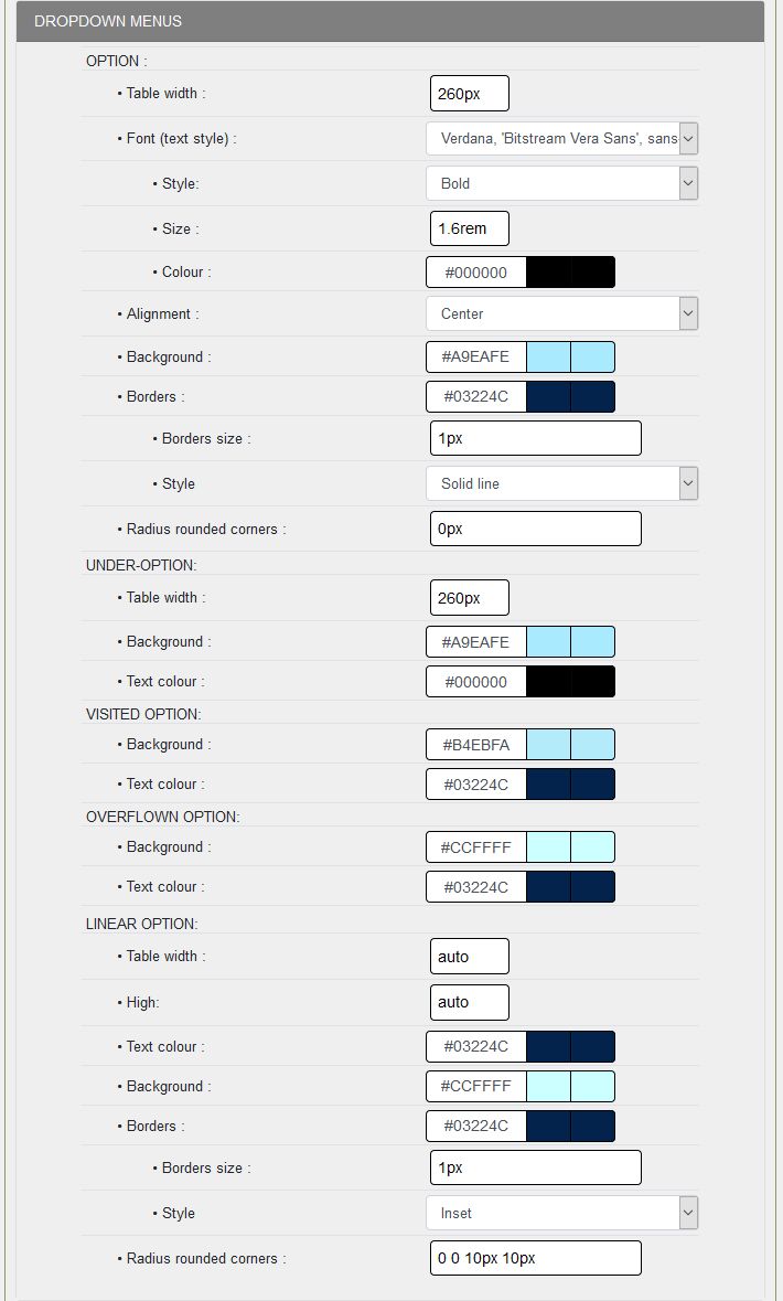
DROP-DOWN MENUS:
By proceeding in the order of the lines, it will be simpler and not so complicated than that, if you have installed the skin6-guppy-03, you can test it line by line.
OPTION:
- Width: you enter the width of your tab, 260px to adjust the vertical menu with the left column.
All skins in the pack are configured with drop-down menus and you will see that the width can vary from one skin to another, but also depending on the number of tabs to put for example in a horizontal menu,...
- Fonts (type of texts): the type of texts, you can choose between 7 families of fonts, here the second one is selected,,,
- Style: choice of options, here bold text for the title,
- Size: in the example 16px, you can choose a size slightly larger than in the skin,
- Text color: the color must be adapted to the background color, here #000000,
- Alignment: any of the 3 options, here Align left,
- Background: Choice of background color, this is #A9EAFE,
- Borders: you specify the border color for the border, for this field #03224C,
- Border size: 1px, 0px no borders
- Style: You select a style from the 8 styles proposed, here Full line,
- Radius of rounded corners: a size in pixels, e. g. 6px, this will depend on the size of the area. 0px, no rounded corners.
SUB-OPTION:
- Width: 260px, no change but it's possible,
- Background: color change for the demo,
- Text color: according to the background color, i. e. white #000000,
OPTION VISITED:
- Background: Color change for the visited option, so #B4EBFA,
- Text color: depending on the background color, so #03224C,
OVERVOLUNTED OPTION:
- Background: Color change for the visited option, so #CCFFFF,
- Text color: depending on the background color, so #03224C,
LINEAR PANEL:
- Width: you define the width of your panel according to the content you want to put in the auto example.You will see in the styleplus.css file that you have to limit to a maximum of 760px. In the demo database, these are the docs with IDs 70, 71, 72, 73 in Admin/Structure/Drop-down menu options,
- Height: same principle depending on the content, in the example auto,
- Text color: the basic color of skin text #03224C, but you can change it,
- Borders: you indicate the color of the border for the border, for this skin #03224C,
- Border size: 4px, wider width to properly delineate the panel,
- Style: You select a style from the 8 styles proposed, Full line in the example,
- Radius of rounded corners: a size in pixels, for example, 0 0 10px 10px and you will have the bottom corners with a rounded 10px.
Look at the skin6-guppy-03 styleplus. css, you'll need a little customization to get to the end of the drop-down menu configuration.
Creation date : 15/12/2020 @ 13:50
Category : - Config Look Tutorial
Page read 3187 times


