Config Default-Theme
The themes are listed one by one in the order in which they are displayed on the Unite Gallery administration page.
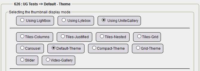
The configuration with default values is displayed by selecting the Default values check box and clicking Save configuration. So we assume you checked the box and then click Save config.
For Default-Theme
Theme options :

- Full screen mode button enabled: ticked, therefore enabled, by clicking on this button the visitor can see the photos in full screen, it depends on the size and quality of the photos, those of the demo gallery are in 1280px and good quality,
- Slideshow on/off button enabled: checked, so enabled, depending on your choice, interesting for mobile,
- Button hide/show panels enabled: ticked, therefore enabled, by clicking on this button the visitor can hide the panels,
- Text panel enabled: ticked, therefore enabled, the text panel is displayed,
- Alignment of the text: left, center, right and left selections,
- Hide panel under width: from 480px in width, the panel is no longer displayed..
Gallery options:
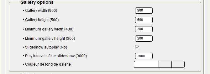
- Gallery width: 900 by default, perfect for the width of central boxes at 940/950px,
- Gallery height: 500 by default, I have put 600 more in relation to my images,
- Minimum gallery width: 400 by default, you must set 300, not more for displaying on smartphones from 320px screens.
- Minimum gallery height: 300 by default, 200 chosen to keep the same ratio,
- Automatic slideshow playback: disabled by default, checked because it's convenient on mobile phones,
- Gallery background color: nothing to preserve the background color of the central boxes.
Slideshow options :
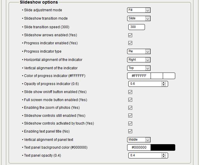
- Slide Adjustment Mode: Default: Fill by default, no change, at selection, choice between Adjustment, Reduction and Fill,
- Slideshow transition mode: Dragging by default, at selection, choice between Drag and Fade,
- Slideshow arrows enabled: checked for display,
- Progress indicator enabled: checked for display,
- Type of progress indicator: Default slider, at selection, choice between slider, slider2 and slider,
- Horizontal alignment of the indicator: to the selection, choice between Left, Center, Right,
- Vertical alignment of the indicator: to the selection, choose between Top, Center, Bottom,
- Progress indicator color: #FFFFFFFF (white) by default, you can try another color,
- Opacity of the progress indicator: 0.6 by default, it is a compromise for visibility,
- On/Off button enabled: checked for display, important for visitor selection,
- Full screen mode button enabled: checked for display,
- Enabling photo zoom: checked for display,
- Slideshow controls always enabled: checked for display,
- Slideshow controls activated by touch: checked for activation
- Enable text panel title: checked for display, if you don't have a text, do not check.
- Text panel background color: #00000000 by default, you can test another color,
- Text panel opacity: 0.4 by default, pay attention to transparency if you increase opacity.
Thumbnails options:
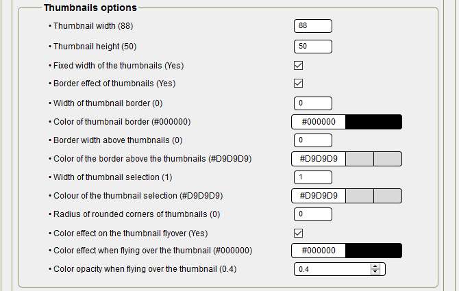
- Width of thumbnails: 88 by default, no change,
- Height of thumbnails: 50 by default, no change,
- Fixed width of the thumbnails: checked for activation,
- Thumbnail border effect: checked for activation,
- Thumbnail border width: 0 by default, no change,
- Thumbnail border color: #00000000 by default, no change,
- Border width above the thumbnails: 0 by default, no change,
- Border color over thumbnails: #D9D9D9 by default, no change,
- Radius of rounded corners of thumbnails: 0 by default, no change,
- Color effect when hovering over the thumbnail: checked for activation,
- Color of the effect when hovering over the thumbnail: #00000000 by default, no change,
- Color opacity when hovering over the thumbnail: 0.4 by default, pay attention to transparency if you increase opacity.
Thumbnails panel options:
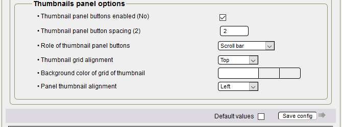
- Thumbnail panel button enabled: checked for activation,
- Thumbnail panel button spacing: 2 by default, no change,
- Role of Thumbnail Panel Buttons: Selecting, choosing Scroll Bar or Item Advance
- Alignment of the grid of the miniatures: to the selection, choice Top, Middle, Bottom, Left, Center, Right,
- Thumbnail grid background color: default,
- Panel Thumbnail Alignment: to the selection, choose Top, Middle, Middle, Bottom, Left, Center, Right,
Building the theme :
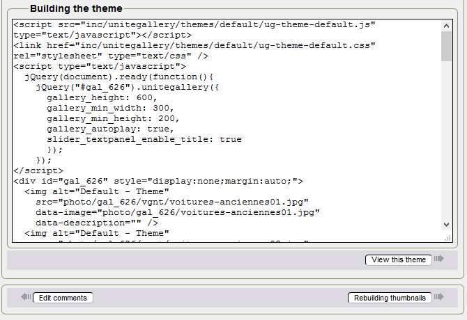
A click on Rebuild Thumbnails is important because the thumbnails are larger, and you add the comment for each photo in the main and secondary language if necessary. We suggest that you do not use the Video Type and Code lines or video address, Theme - Videos is preferable for videos.
Here is the code of your updated gallery, a click on Show this theme and your gallery is displayed in a new tab.
Above all, do not modify the code manually to get your purposes, change the configuration again for the corresponding part, then save the configuration and display the theme again.
You're reading this line! Congratulations, you just finished configuring the sixth theme!
Tutorial by Papinou and Saxbar for the GuppY Team - November 2017 - CeCILL Free License
